One of the most exciting features of the TrackMate rating system is the stack. An incredible tool for the speedy analysis of the ratings in relation to the other runners in the race. It has many uses and can be an incredibly powerful tool when analysing races. There is a stack for both sets of ratings on every race card.
On this page you will find explanations for the following:
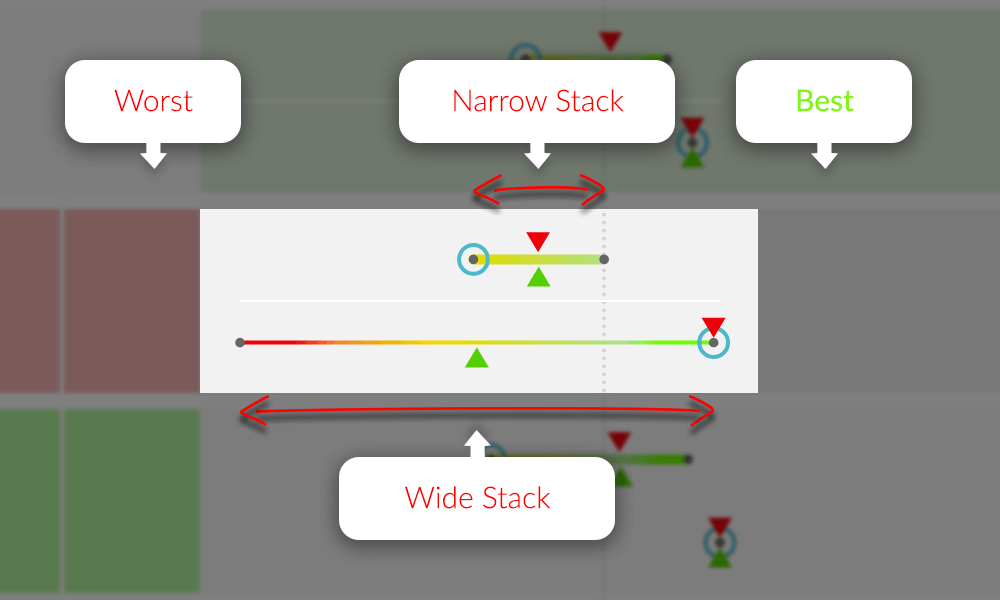
- Range of Performance – Visual representation of each horses rating range the qualifying form.
- Worst Rating – Dot on the left of each stack.
- Best Rating – Dot on the right of each stack.
- 100 Rating Icon – The green triangle is the average rating over the last 100 days.
- 200 Rating Icon – The red triangle is the average rating for the last 200 days.
- Latest Race Icon – The blue circle is the latest rating from the last race run.
- Vertical Guide Line – Used to compare stacks vertically across the whole card.
- Great Stacks – An example of what you should be looking for in a great looking stack.
- Stack Point Information Popup Examples – Information from previous form races.
The “Stack” is a graphical representation of each horse’s range of performance from the qualifying form.
- The top stack is speed ratings and is a thicker line.
- The bottom stack is EDGE ratings and is a thinner line.
Both stacks have the same rating markers for each horse’s qualify form.
Range of Performance
The narrower the line is, the more consistent the horse has been as the range between worst and best is less.
The wider the line, the less consistent the horse has been as the range between worst and best is greater.
Worst Rating
The dot on the far left of each horizontal line is the horses worst rating for the qualifying form period.
Best Rating
The dot on the far right of each horizontal line is the horses best rating for the qualifying form period.
100 Day Rating Icon
The green triangle is the average speed rating for qualifying races for the last 100 days.
200 Day Rating Icon
The red triangle is the average speed rating for qualifying races for the last 200 days.
Latest Rating Icon
The blue circle is the rating for the last qualifying race.
Vertical Guide Line
There is a vertical guide line feature that appears when you hover over the grey guide bar under the stack column title. The line will be red when active as you move left and right over the guide bar. It will then stop moving and change to a grey dotted line when you move off the guide bar.
This line is extremely useful to get a vertical comparison between all runners stacks in the race making it easier to visualise where the stacks and icons are in relation to each other.
Great Stacks
The stack can identify opportunities where horses could be deemed as well above the standard of the rest of the field.
Here are two example of how to identify a “great stack”

In this example 1, you will clearly see that the stack for Soto Sizzler indicates that his form is way out in front of the rest of the field in both Speed and EDGE ratings.

You will see in example 2 that Queen Of Kalahari’s “worst” run is as good as any of the other runners “best” run and its best run is clearly best of all.
The stack can also be used to find “poor value” horses and opportunities to “Lay” horses on the exchanges.
Stack Point Information Popup Examples
Latest Rating (blue circle)

100 Day Rating (green triangle)

200 Day Rating (red triangle)

Best Rating (far right dot)

Worst Rating (far left dot)
